

Krea 3 vs Krea 2: What Changed, and Which Should You Use?
Krea 2 and Krea 3 emphasize different creative jobs. Krea 2's published workflow centers on exploring and controlling visual style. Krea 3 emphasizes editing an existing image while retaining the subjects and details that matter. If you are choosing a look, start with style exploration; if the product is already approved and only the scene should change, start with an editing brief.
That is a workflow recommendation based on their documentation, not a measured ranking. A newer version number alone does not show which model will produce an acceptable result for your project.
Krea 3 vs Krea 2 at a glance
| Decision | Krea 2 workflow | Krea 3 workflow |
|---|---|---|
| What are you trying to decide? | The palette, medium, texture, or overall treatment | What changes around an established subject |
| What does the reference provide? | A visual style to carry into a new image | A subject or details to retain during an edit |
| What belongs in the brief? | The subject, chosen aesthetic, and room for exploration | The source, requested change, and features to preserve |
| What makes a result useful? | A direction that fits the campaign | An edit that meets the brief without unwanted product changes |
| What should you inspect? | Composition, visual hierarchy, and consistency of style | Geometry, markings, materials, and the requested scene change |
Krea's Krea 2 introduction describes its focus on aesthetics and creative control; the Krea 3 announcement describes its editing focus. These are differences in emphasis, not proof that either model is limited to a single task.
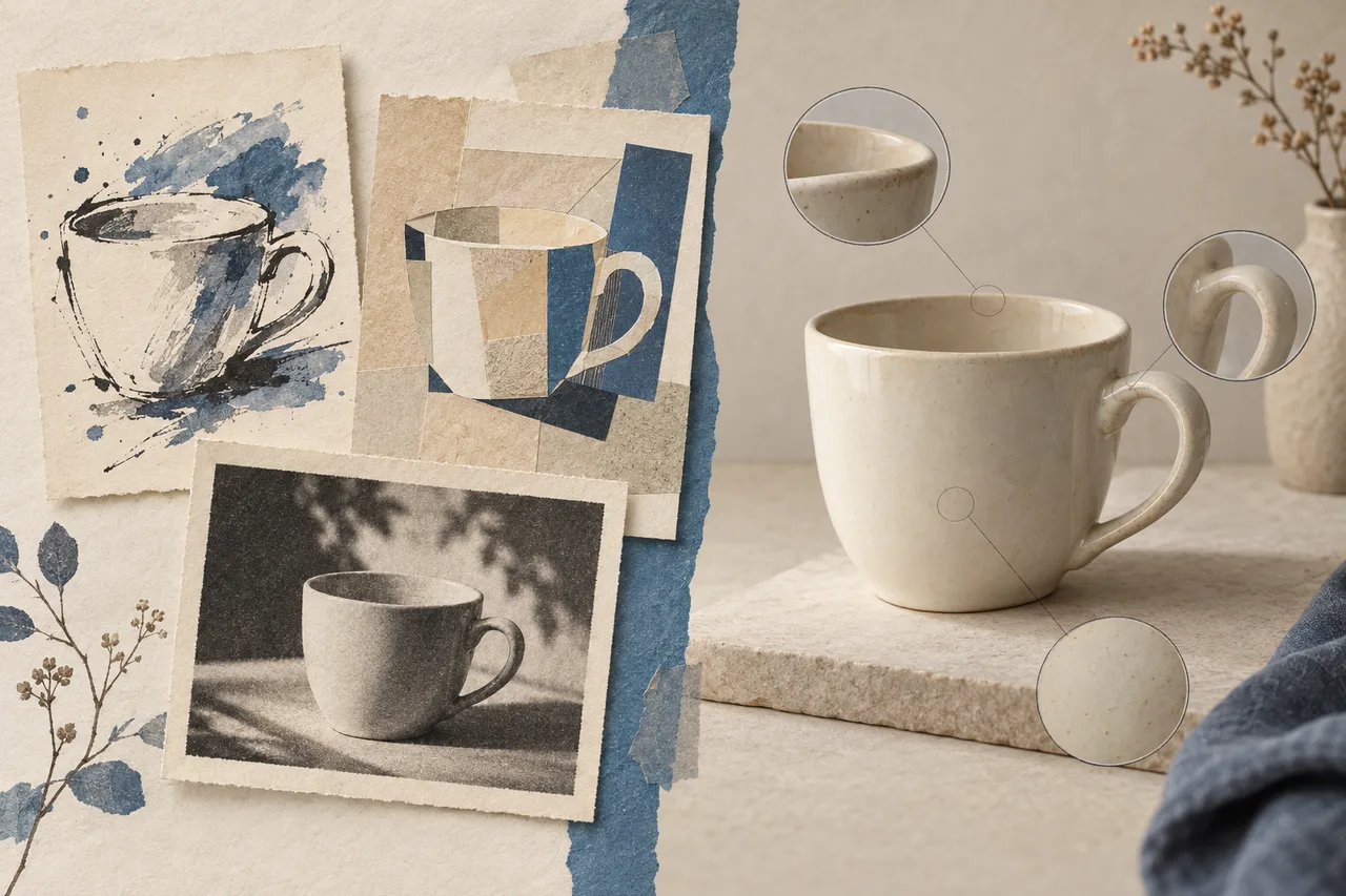
AI-generated illustration of two creative tasks. These are not Krea 2 and Krea 3 outputs or comparative test results.
Style reference or product reference?
A reference can answer two different questions: “What should this look like?” and “Which object must stay the same?” Confusing them makes a prompt harder to evaluate.
Imagine a photograph of a ceramic cup with warm colors and visible film grain. For a poster about breakfast, you might want those colors and grain applied to a new composition. The cup itself can change. For a product campaign, you may need that exact cup, including its handle and glaze, placed on a different table.
Krea's style-reference documentation describes controls for how strongly a reference's visual treatment influences the result. That is useful when the reference is an aesthetic direction. It is not, by itself, evidence that a particular product's dimensions or lettering will be preserved.
Label each input before using it: style, product, detail, or setting. If a reference is only for lighting, say so. If it defines the product, list the details against which you will judge the output.
Choose a style workflow while the look is open
Suppose a client wants a campaign for a ceramic cup but has not chosen between an illustrated poster and a restrained photograph. At this stage, making different visual directions is useful. You are choosing a treatment before investing in precise production details.
A concept brief might be:
A ceramic cup on a breakfast table, rendered as a loose ink illustration with warm paper tones. Use a simple poster composition and generous clear space above the cup for a headline. No lettering.
For the next direction, change the medium and composition deliberately. Compare an illustration with a photographic treatment rather than adding more adjectives to the same prompt. Judge whether each direction supports the message and works in the required layout.
Once the look is approved, save the references and describe what you want to keep: muted colors, visible texture, generous spacing, or a particular lighting treatment. That gives the next stage a more useful brief than “make it look like the good one.”
Choose an editing workflow when the object is fixed
Now suppose the cup is a real product. Its handle shape, rim, glaze, and printed mark have already been approved. You need a breakfast scene around it, not a new cup design.
Use a brief such as:
Use the uploaded cup as the product source. Retain its handle shape, rim, proportions, glaze color, and existing mark. Place it on a pale breakfast table beside a folded linen napkin. Keep the source viewing angle and leave clear space on the right for copy. Add no new lettering or decoration.
Compare the result with the source before approving the atmosphere. If the handle changes, an attractive background does not make the image suitable for a product listing. If the cup is accurate but the empty space is too small, revise the layout instruction first.
The product-photo tutorial develops this into a reference checklist, defect table, and stopping rule. Keeping those checks separate from style preference makes the decision easier to explain to a client or teammate.
Compare the cost of usable images
A fast first preview and a low generation price are only part of the work. A usable image may also require rejected attempts, manual cleanup, and another review.
For a small comparison, use the same source assets, layout requirements, and acceptance criteria wherever the selected models are available. Give each workflow a fixed trial budget. Record the settings so you know what you compared.
| Record | Why it matters |
|---|---|
| Attempts and accepted outputs | Shows how often the workflow met this particular brief |
| Generation charges or credits | Includes rejected attempts, not just the chosen image |
| Preparation and correction time | Makes hidden finishing work visible |
| Remaining defects | Prevents a visually pleasing but inaccurate result from counting as accepted |
A simple calculation is total generation spend ÷ accepted images. If no image passes, report that outcome instead of presenting a cost per usable image. Track editing time separately, or value it consistently across both workflows. Do not mix credits from different services as though they were the same currency.
This is a method for your own trial. No side-by-side Krea 2/Krea 3 generation test was performed for this article, so there is no claimed winner on speed, cost, or preservation accuracy.
Which should you use for your next image?
- A new visual direction: try a style-focused workflow and compare distinct treatments before polishing details.
- An existing product in a new scene: use an editing workflow, retain the original source, and inspect the construction details.
- A campaign that needs both: settle the look, then test whether the chosen editing workflow can apply it while retaining the product.
- Exact text, marks, or small fittings: plan a finishing step and compare against approved assets; neither a version label nor a convincing preview replaces inspection.
For model access, reference limits, and a first-image checklist, continue with How to Use Krea 3. If you want to try the general briefs on this site, use the currently available models in the Krea3.ai image workspace; this comparison does not establish that both models are available there.
Documentation checked October 16, 2026. The selection advice is an editorial interpretation of the cited workflows, not a benchmark.